Real-Time Production Dashboard: The Heart of the Smart Plant
In the manufacturing and assembly plants of Saltillo and Monterrey, the pace of work is fast. Operations managers and production supervisors face the daily challenge of meeting strict quotas and international quality standards. Traditionally, to know how many parts were produced in a shift or how many came out defective, you had to wait until the end of the day for operators to hand in their report sheets and for someone to enter them into an Excel file.
Working with historical data is like driving a car while looking only in the rear-view mirror: you learn about obstacles after you've already passed them. Industry 4.0 completely changes this dynamic by implementing a Real-Time Production Dashboard. This digital tool has become the essential visual command center for optimizing efficiency and reacting immediately to any event on the shop floor.
What Is a Real-Time Production Dashboard?
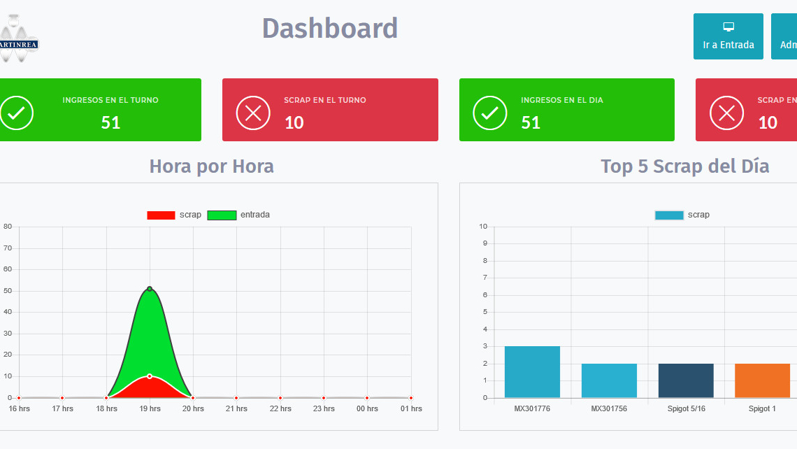
A real-time production dashboard is an interactive graphical interface that collects, processes, and displays operational data from production lines at the very moment it occurs. Through direct connections to sensors, machine Programmable Logic Controllers (PLCs), and operational mobile apps, this system turns complex technical variables into easily digestible visual information.
Strategically placed on giant industrial screens above the assembly lines (Andon systems) or accessible from tablets and desktop computers, these dashboards eliminate guesswork and unify the criteria for success across the entire organization, from the operator at the workstation to senior management.
Key Metrics Your Industrial Dashboard Should Include
For a dashboard to be truly effective in a B2B and industrial environment, it must focus on the key performance indicators (KPIs) that impact the business's profitability:
1. Current Machine Status (Availability)
Using a universal color code (Green: Running, Yellow: Adjustment/Setup, Red: Failure/Stoppage), the dashboard shows the instant status of every machine in the plant. This allows visual bottlenecks to be detected within seconds of a technical interruption.
2. Production Rate vs. Target (Throughput)
Shows a real-time comparison between the number of good parts that should have been produced up to the current minute and the actual parts produced. A dynamic progress bar alerts the team if the shift is "ahead" or "behind" the production plan.
3. Overall Efficiency Monitoring (OEE)
The OEE (Overall Equipment Effectiveness) indicator is broken down and calculated automatically second by second. By watching instant trends in Availability, Performance, and Quality, the process engineering department can identify which specific factor is eroding overall productivity.
4. Scrap Counter and Classification
Records the amount of rejected material as it happens. By linking the dashboard to mobile apps at the inspection stations, the system shows not only how many parts were scrapped but also the main root causes (for example: burrs, out of dimension, cosmetic defect), making quick containment of quality alerts easier.
Operational Benefits of Real-Time Visualization
- Proactive Decision-Making: Instead of lamenting a loss at the end of the week, supervisors can intervene within 5 minutes of detecting a drop in the production rate, saving the shift's target.
- Drastic Reduction of Micro-Stoppages: By automating data capture, the system records stops under 20 seconds caused by dirty sensors or minor jams, which usually go unnoticed in manual logbooks but add up to hours of downtime each month.
- Staff Empowerment and Motivation: Showing clear targets and actual progress on the production floor fosters a culture of accountability and self-management in work cells.
- Efficient Cross-Department Communication: When a critical stoppage occurs, the dashboard can trigger automated alerts that notify the right maintenance technician by email or message, reducing Mean Time To Repair (MTTR).
UI/UX Considerations for Industrial Interfaces
Designing a dashboard for a corporate office is very different from designing one for the production floor. A successful industrial interface must follow strict user experience (UI/UX) rules:
- Readability at a Distance: Critical numbers and indicators must be large enough for an operator to read from 5 or 10 meters away from the screen.
- Visual Simplicity: Avoid cluttering the screen with complex charts or unnecessary text. A clean design lets anyone understand the health of the line with a single two-second glance.
- High Contrast: Consider the lighting conditions of industrial buildings. Use dark or high-contrast backgrounds so that glare from ambient light doesn't prevent the data from being read.
Conclusion
Implementing a Real-Time Production Dashboard is one of the most solid, highest-ROI steps a plant in Saltillo or Monterrey can take toward Industry 4.0. By digitizing metric capture and centralizing it on smart visual displays, companies eliminate paper bureaucracy, optimize the capacity of their current equipment, and raise the operational standards required to compete successfully in global supply chains.
Is your production floor still operating blind?
Leave paper reports and outdated Excel files behind. At LT CODER we specialize in developing real-time Production Dashboards and KPI Indicators for the manufacturing and automotive sectors in Monterrey and Saltillo. We design intuitive interfaces and connect your machines so you can take full control of your lines.